











Follow our new Instagram feed here
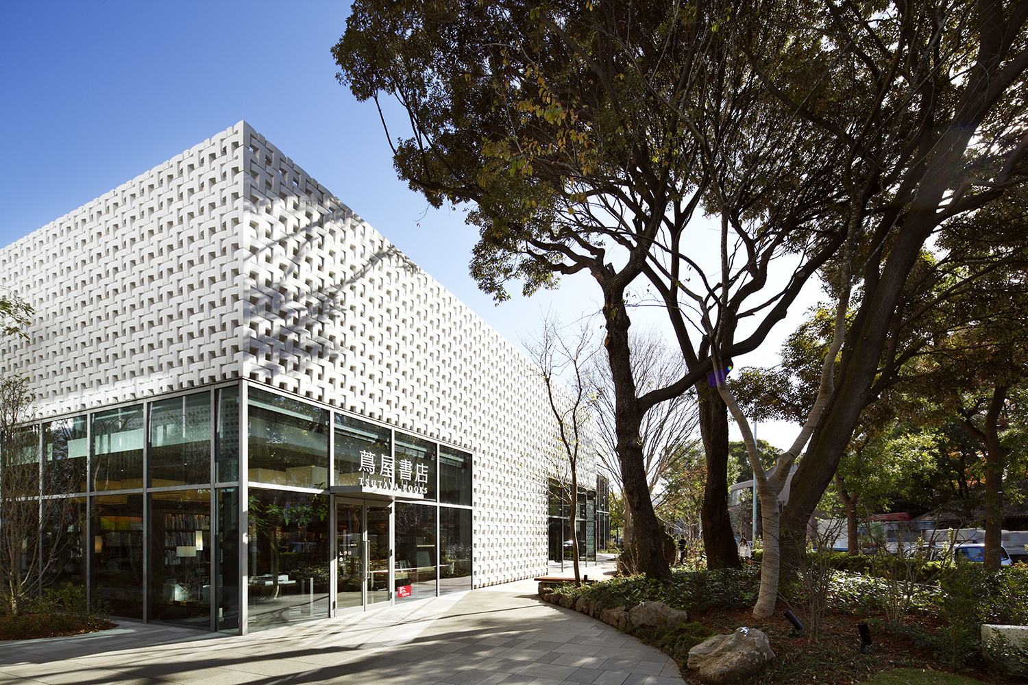
Klein Dytham architecture's Daikanyama T-Site is a campus-like complex for Tsutaya, a giant in Japan’s book, music, and movie retail market. It was opened to the public in December 2011.

Location - Daikanyama, Shibuya-Ku, Tokyo
Principal Use - Retail, Apartments
Total Floor Area - 5,907.47 sqm

Daikanyama T-SITE has won a string of international plaudits including World’s Best Shopping Centre at the World Architecture Festival 2013 and the Grand Prize at Design For Asia Awards 2013.

Credits:
Architecture and interior design: Klein Dytham architecture
Art Direction: Tomoko Ikegai
Architectural Consultant: RIA
Structural Engineer: Structured Environment
Main Contractor: Kajima Construction
Photography: Nacasa & Partners
Full text.
KDa’s new Daikanyama T-Site is a campus-like complex for Tsutaya, a giant in Japan’s book, music, and movie retail market. Located in Daikanyama, an up-market but relaxed, low-rise Tokyo shopping district, it stands alongside a series of buildings designed by Pritzker Prize-winning architect Fumihiko Maki.
Drawing on all KDa’s design skills – architecture, interior, furniture and product display – the project’s ambition is to define a new vision for the future of retailing. Tailored particularly to over-50 “premier age” customers, Tsutaya’s normal product range is complimented by a series of boutique spaces carrying carefully curated merchandise. This selection of goods is intended not to be exhaustive but stimulating – sections include art, architecture, cooking, cars, design, history, and literature. Each section is run by a concierge – like their intended customers they are all over 50, and both have expert knowledge of their subject area and can provide other services (in the stores travel section you can book a holiday!) The project also merges the worlds of new and old media. Movies, for example, can be bought, rented, or downloaded, and while iPads are on hand throughout the store as guides to the stock on offer, that stock also includes Tokyo’s largest selection of pens.
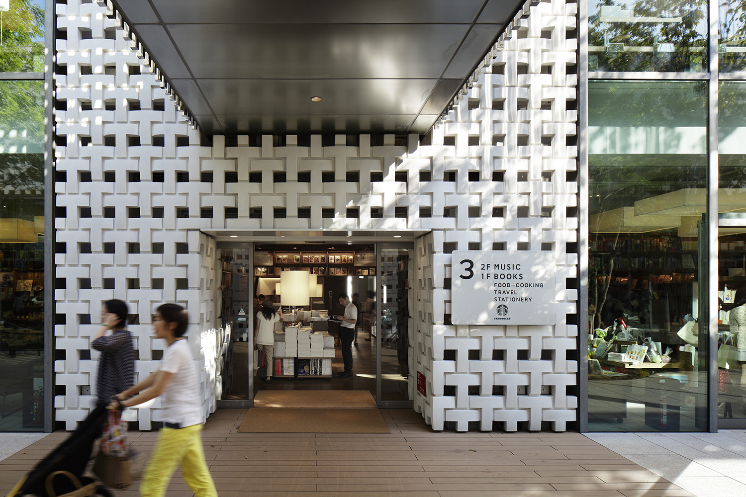
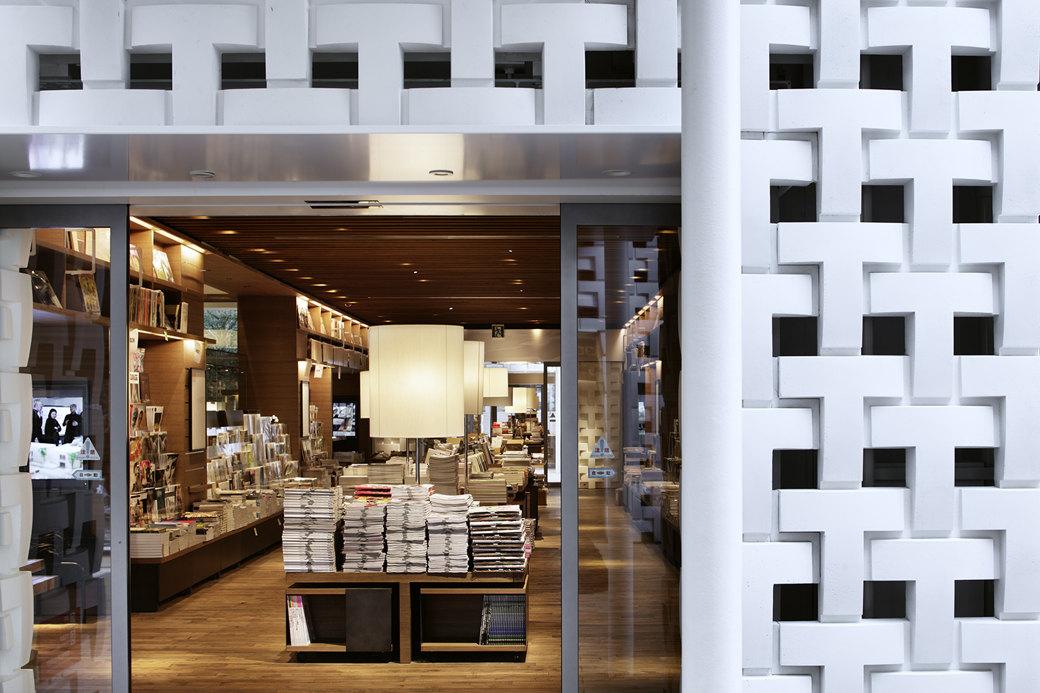
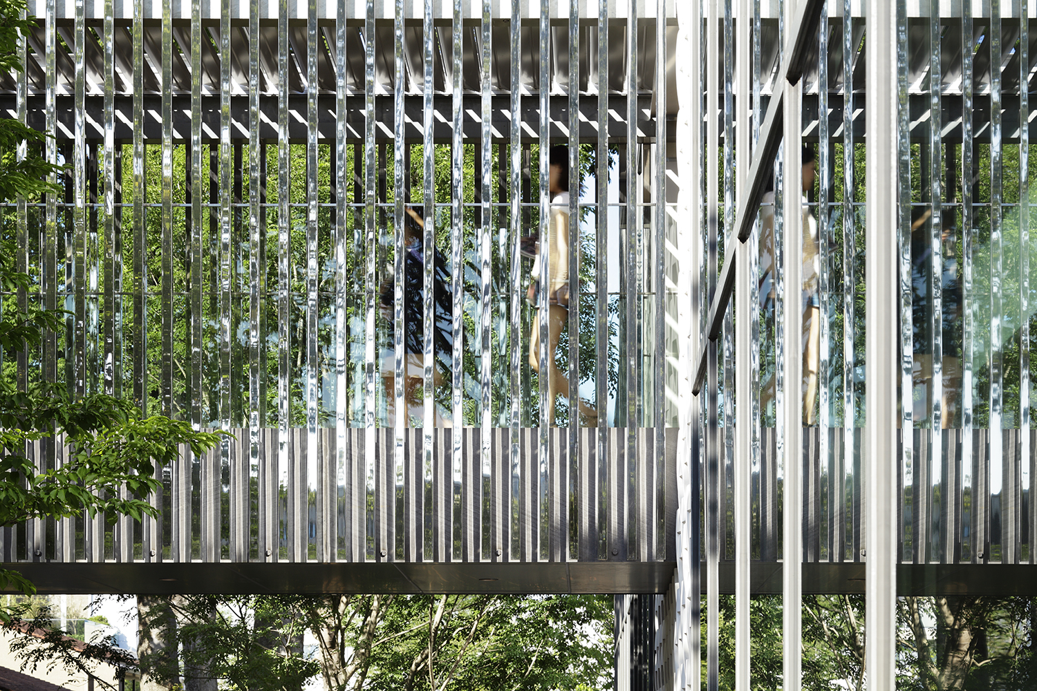
Cunningly solving a number of planning issues, including retention of the beautiful trees standing on the site, the complex was set back from the street and split into three pavilions. This arrangement of two- and three-storey buildings creates relaxed walkways between buildings. Two bridges clad in polished stainless steel battens connect the pavilions, reflecting the surroundings and creating gateways for visitors passing through the site. In the design of the pavilion exteriors, KDa’s characteristic wit emerges in subtle ways – the perforated screens of the façade are formed from the Ts of the Tsutaya logo, and much larger T-shapes are disguised in the building plans and elevations. The Ts are no mere graphic play, but provide fully three-dimensional organizing principles, guiding how the plan is laid out and defining the arrangement of the structural system.
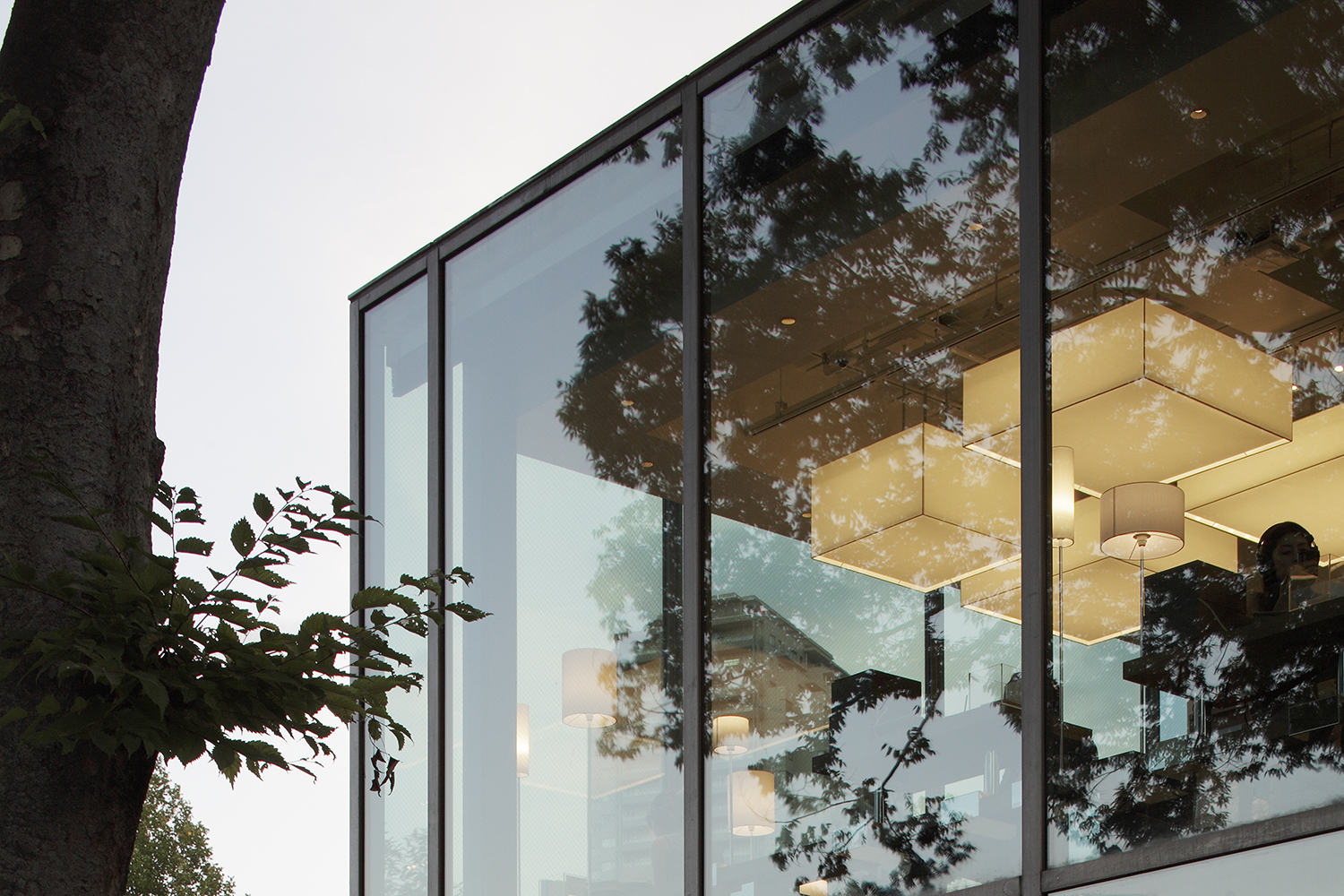
The pavilions contain retail space on the lower floors with accommodation above. Internally, KDa didn’t want a slick “department store” feel, and so selected materials such as aged timber flooring to create a relaxed space – part university library, part warehouse. The three pavilions are linked by an organizational spine – called the “magazine street” – which passes through interior and exterior, linking the three buildings together. To reinforce its presence, the magazine street’s shelving, flooring and slatted ceiling are all timber, even where it runs outside under the bridge. Elsewhere, a stone floor creates continuity between interior and exterior while an open ceiling gives a warehouse feel (big lighting lanterns hang down to subtly mask the buildings’ innards) and signage designed by graphic maestro Kenya Hara was printed on perforated metal to create more openness and visibility.
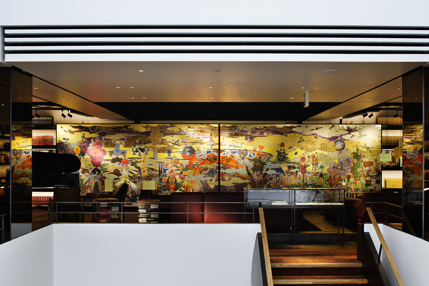
Within this organizational and material framework, each of the boutique spaces has its own character – the shelving in the literature section is tightly packed to evoke Tokyo’s atmospheric Jimbocho second hand book district, while in other spaces overhead shelves are used to make them feel more intimate. Other facilities include a café, an upscale convenience store, and the Anjin Lounge. Located in the center of the complex, this lounge includes a bar, a performance space, a collection of artworks and rare books for sale (including a signed Frank Lloyd Wright volume!) that visitors can enjoy as they eat, drink, read, chat, or relax. Visitors to the lounge can also browse an amazing world magazine archive that includes beautifully bound collections of such classics as Domus, Esquire, and Abitare – an entire class of fashion students was spotted pouring over the archive’s back issues of Vogue.
Despite its design innovations, this was not a big budget project – it was low cost and produced extremely quickly. The whole project was completed in 20 months, with construction taking just 11 months despite disruptions to Japan’s construction industry caused by the Tohoku earthquake and tsunami. KDa were awarded the project through an invited competition, requiring them to beat out many of Japan’s highest profile architectural firms. Their scheme triumphed by tackling both explicit branding issues and architectural subtleties in every aspect of the building. Merging the digital and analogue worlds, and providing for both sophisticated tastes and simple curiosity, KDa’s design is intended to allow a new retail paradigm to emerge.

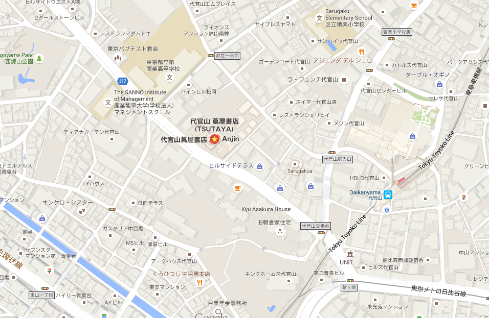
Daikanyama T-SITE is located in Daikayama Google Map Link
Check out the reviews in TimeOut Magazine and CNN